Popular Articles
Ultimate Guide to 360° Comprehensive Interior Detailing — Deep Clean, Sanitize and Protect Your Car’s Cabin
2026.02.04
Singapore Car Window Tinting Guide: Rules, Benefits, and How to Choose the Right Film
2026.02.04
The Complete Guide to Colour Wraps — Transforming Your Car’s Look with Style and Protection
2026.02.04
About Company
Colorfuul is a global leader in high-end automotive films, offering Color TPU PPF, Transparent PPF, PET Window Films, and Vinyl Wrapping. With exports to over 100 countries, we deliver consistent quality, competitive pricing, and professional service. Beyond production, we provide OEM/ODM customization, shaping the future of automotive aesthetics.
 mary@colorfuul.com
  86 13541196952
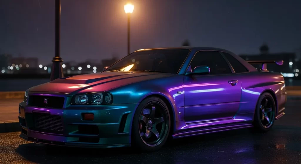
 Midnight Purple Color (Meaning, Variations & Visual Behavior)
Midnight Purple as a color is a deep, near-black violet that achieves its unique character through a specific balance of low-frequency purple pigments and dark charcoal undertones, which causes it to appear differently depending on the light source and the viewing angle. It is a color defined not just by its static hue, but by its relationship with light; in shadows, it behaves like a neutral black, while direct illumination reveals a vibrant, crystalline purple that seems to glow from within.
What Is Midnight Purple as a Color?
Midnight Purple color is a highly saturated, extremely dark violet that sits on the furthest end of the visible spectrum before transitioning into total blackness. You can think of it as a "hidden" color—one that maintains a stealthy, understated presence in low light but transforms into a high-impact, multidimensional shade when exposed to bright, direct light.
In color theory, Midnight Purple is achieved by mixing a primary purple base with significant amounts of black and a touch of deep blue. This combination creates a "cool" temperature that feels sophisticated and expensive. Unlike a standard dark purple, which may simply look like a muted plum, Midnight Purple has a "midnight" quality that suggests vastness and mystery, much like the deep sky at the end of twilight. It is a color that relies on its low brightness to create a sense of weight and authority.
How Is Midnight Purple Different From Standard Purple Shades?
Midnight Purple differs from standard purple shades because it prioritizes depth and light-reaction over consistent, flat saturation. While a royal or bright purple remains unmistakably purple regardless of the lighting, Midnight Purple is designed to be a "shapeshifter" that hides its true identity in the shadows.
| Purple Type | Brightness | Depth | Visual Character |
| Royal Purple | High | Low | Bold, regal, and immediately visible. |
| Plum/Burgundy | Medium | Medium | Warm, fruity, and consistent. |
| Midnight Purple | Very Low | Extreme | Moody, mysterious, and light-reactive. |
| Lavender | High | None | Soft, airy, and light-hearted. |
You will find that dark purple shades often look "muddy" if they are too desaturated. Midnight Purple avoids this by keeping a high concentration of violet pigment beneath its dark exterior. This allows it to maintain a "clean" look even when it is at its darkest point. Its visual character is one of "quiet power"—it does not shout for attention, but it commands it once the viewer notices the complexity of its tone.
What Are Midnight Purple 2 and Midnight Purple 3?
Midnight Purple exists in multiple defined variations that differ in their "flip" or color-shifting intensity. These variations were developed to push the limits of how a dark color can interact with light, moving from a subtle violet to a complex, multi-tone experience.
| Version | Tone Balance | Visual Depth | Overall Impression |
| Midnight Purple (Original) | Deep Violet / Black | High | Classy, subtle, and stealthy. |
| Midnight Purple 2 | Blue / Purple Flip | Extreme | Modern, technical, and reactive. |
| Midnight Purple 3 | Purple / Blue / Gold | Infinite | Aggressive, multi-chrome, and exotic. |
Midnight Purple 2 is characterized by a more prominent blue undertone. When light hits this version, you see a "flip" where the color shifts from purple to a metallic teal or blue. Midnight Purple 3 is even more complex, incorporating multi-chrome pigments that can reveal hints of gold or bronze at extreme angles. These are not just different shades; they are different "behaviors" of light, offering a more dynamic visual experience than the original deep violet.
Why Does Midnight Purple Look Different in Different Lighting?
Midnight Purple is highly light-sensitive because its pigments are designed to react to the intensity and angle of the light waves hitting the surface. The deep black base absorbs most of the light, but the metallic or pearlescent purple particles reflect specific wavelengths back to your eyes, meaning the color you "see" is entirely dependent on the light source.
How different lighting conditions affect the appearance:
- Direct Midday Sunlight: The purple is at its most vibrant and saturated, appearing like a glowing jewel.
- Overcast / Natural Daylight: The car looks like a dark, sophisticated plum or a deep charcoal-violet.
- Artificial / LED Light: Cool white lights bring out the blue and magenta highlights, often looking "ink-like."
- Dusk / Shadow: The color recedes into a near-black, providing a stealthy, understated look.
This sensitivity is why the color is so popular in high-end design. It provides a "living" finish that feels as though the object is changing throughout the day. You are not just looking at a static color; you are looking at a reaction to the environment.
Is Midnight Purple a Color-Changing Color?
Midnight Purple is a color-changing purple in the sense that its perceived hue shifts based on light interaction, though the actual pigment itself remains the same. This effect is often achieved through the use of "interference pigments"—tiny particles that cause light waves to bounce off at different angles, creating a shimmering, multidimensional effect.
Technically, it is an "optical illusion" of depth. Because the base is so dark, your brain interprets the light reflections as a secondary color layer sitting on top of a black void. This is what gives the color its "bottomless" look. While it is not a "chameleon" color that turns green or orange, its shift between black, blue, and violet is significant enough that it is widely categorized as a reactive or shifting finish in the world of visual design.
How Does Midnight Purple Compare to Other Dark Colors Like Black or Blue?
Midnight Purple sits between multiple dark color families, borrowing the stealth of black and the coolness of blue while maintaining the unique emotional weight of violet. It is often used as a "black alternative" for those who want a dark aesthetic that has more personality and depth.
| Color | Dominant Tone | Light Reflection | Emotional Feel |
| Jet Black | None (Neutral) | Mirror-like | Formal, stark, and absolute. |
| Navy Blue | Cool Blue | Consistent | Professional, stable, and calm. |
| Midnight Purple | Deep Violet | Shifting / Multidimensional | Creative, mysterious, and elite. |
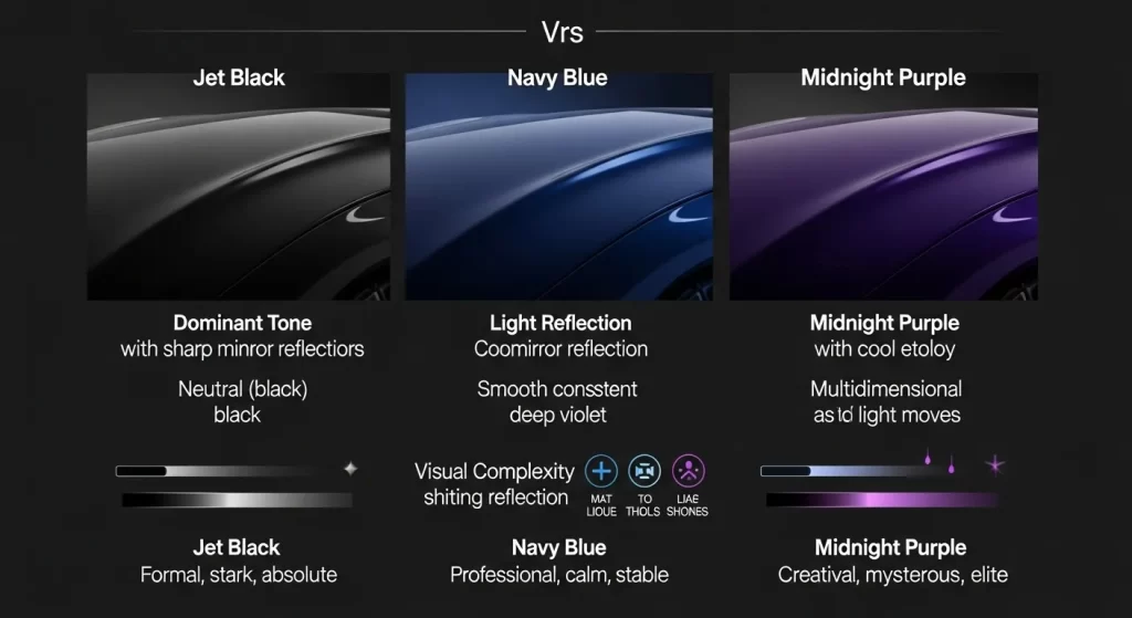
Compared to midnight purple vs black, the purple version feels much more "alive." Black absorbs almost all light, whereas Midnight Purple uses the light to tell a story. Against a deep navy blue, Midnight Purple feels warmer and more "boutique," suggesting a level of customization and intentionality that a standard blue does not convey. It is the color of choice for those who want to be "dark" without being "plain."
What Does Midnight Purple Represent in Color Psychology?
Midnight Purple carries strong psychological associations, blending the stability of blue with the energy of red to create a sense of mystery, luxury, and "quiet confidence." Because purple is historically associated with royalty—due to the rarity of the dye—this deep version is perceived as highly prestigious and exclusive.
In midnight purple psychology, the color is often linked to:
- Mystery: Its ability to hide in the shadows suggests something hidden or undiscovered.
- Creativity: It is a non-traditional choice that signals an artistic or "out-of-the-box" mindset.
- Sophistication: The dark tone feels grounded and mature, unlike brighter, "louder" purples.
- Introspection: Much like the night sky, it encourages a sense of looking inward and deep thinking.
When you see this color, your brain registers it as "special." It is not a common color found in nature, so it immediately signals that the object it is applied to is custom, rare, or high-value.
Where Is Midnight Purple Commonly Used?
Midnight Purple appears across many visual fields, ranging from high-end industrial design to digital interfaces and fashion. Its versatility lies in its ability to act as a neutral "dark" while providing a surprise burst of color when viewed up close.
Common usage contexts include:
- Automotive Design: Used as a "hero color" for performance vehicles to highlight aggressive body lines.
- Fashion: Seen in evening wear and high-end accessories where a "velvet" look is desired.
- Digital Interfaces: Used in "Dark Mode" UI to provide a sense of depth and luxury without the harshness of pure black.
- Luxury Packaging: Used to signal that a product is premium, rare, or artisanal.
- Home Interiors: Used in accent walls or furniture to create a moody, "jewel-box" atmosphere.
Why Is Midnight Purple Considered a “Pillar Color”?
Midnight Purple is considered a pillar color because it serves as a foundational "hero" shade that other design trends are built around. A pillar color is one that remains stylistically and commercially relevant across decades, outlasting temporary fashion fads. Midnight Purple qualifies because it has maintained a cult-like following in the design community for over 30 years.
It is a "safe" way to be bold. Because it is so dark, it does not risk looking "tacky" or "cheap" in the way that a neon or bright color might. It anchors a design, providing a solid, dark foundation while allowing the designer to play with light and texture. It is a reliable, high-intent color that consistently resonates with the human desire for elegance, mystery, and exclusivity.
How Is Midnight Purple 2 Different From the Original Shade?
Midnight Purple 2 refines the original tone by introducing a much more aggressive blue-violet "flip." While the original version is a deep, consistent violet, Midnight Purple 2 utilizes pearlescent pigments that catch the light to reveal a metallic teal or indigo shimmer. It is a more "technical" version of the color, often preferred by those who want the color-shifting effect to be the primary focus of the design.
What Makes Midnight Purple 3 Visually Distinct?
Midnight Purple 3 is a later visual evolution that incorporates multi-chrome technology, allowing the color to shift through a broader spectrum. When looking at Midnight Purple 3, you will notice that it doesn't just stop at blue; it can reveal hints of gold, bronze, and even magenta at sharp angles. It is the most "extreme" version of the Midnight Purple family, offering an exotic, liquid-like appearance that changes entirely as you walk around it.
What Does Color Psychology Say About Midnight Purple?
Midnight Purple blends mystery with confidence, serving as a visual shorthand for an imaginative yet grounded personality. By exploring Color Psychology, you can see how this shade promotes a sense of "quiet power." It is less about seeking outward attention and more about expressing a sophisticated, internal sense of self. It is the color of the "creative elite"—those who value depth and subtlety over raw volume.
Is Midnight Purple Actually a Color-Changing Shade?
Midnight Purple appears to change due to light interaction, but it is technically a "reactive" color rather than a true chameleon pigment. As noted in the discussion of whether Midnight Purple is Color-Changing, the effect is based on "angle-dependency." The actual pigments do not change, but the way your eye perceives the light bouncing off the dark base creates a shifting violet-to-black gradient that feels alive and moving.
Why Is Midnight Purple Treated as a Pillar Color?
Midnight Purple anchors many design styles because it offers a timeless balance of neutrality and expression. According to the Midnight Purple, a pillar color is one that remains commercially relevant across industries. Whether it is a luxury watch, a high-performance car, or a high-end digital theme, Midnight Purple provides a reliable way to communicate prestige and mystery without ever feeling "out of style."
Final Thought
Midnight Purple is a decision to prioritize depth over brightness. It is a color for those who understand that the most interesting things are often hidden in the shadows, waiting for the right light to reveal their true nature. Whether you are designing a physical product or a digital space, Midnight Purple provides a sophisticated, multidimensional foundation that rewards the viewer for taking a closer look.


